A new season is here, and that means it’s time to look ahead–to the beauty and design that awaits us in the coming year. That’s right–The Pantone Color Institute has announced their upcoming palette, spanning a range of gorgeous shades, from jewel tones to soft neutrals. Whether you’re a fan of interior design or the evolution of color across any industry, join us as we reveal the upcoming season’s colors and how they are being used.
Meet the Color Palette
We love hearing voices from The Color Institute describe the thinking behind the color palette selections, including the passion for “season-less” shades in warm, familiar tones paired with charming purples, pinks and notes of soft peach. Just by viewing the palette, you can easily pick up on the harmony–how neutrals and colors work together to create a stunning, but lived-in vibe.
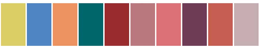
The Top Neutrals
In home design, neutral colors are often those that can *play nice* with all other colors. Selections can change over time–like anything–but many times these colors are selected due to their ease of use within the home, often the timeless atmosphere they create. Common color tones are found in the gray, beige and white families. There are also “colors” like blues and greens that sneak in when they have a foundational grip in design.
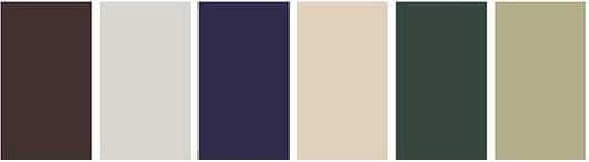
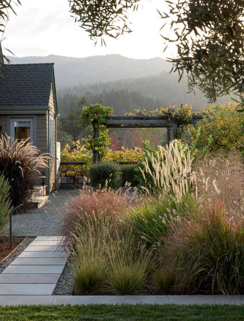
Let Nature Inspire
Organic, textured, full of dimension…are we talking about interiors? Or does this sound like the great outdoors? You would be right if you said, “Both.” Nature has been leading the design world for generations, and this year’s color palette is taking the perfect cues. A perfectly imperfect mixture of warm neutrals and splashes of color come together for a unique scene and just the right balance to make it feel intentional, but comfortable.
Be True to You
The Color Institute never misses the chance to encourage people everywhere to be true to themselves, using color as an opportunity for self-expression. The colors might look slightly different from season to season, but the message is the same: If you surround yourself with what you love, it will never go out of style.
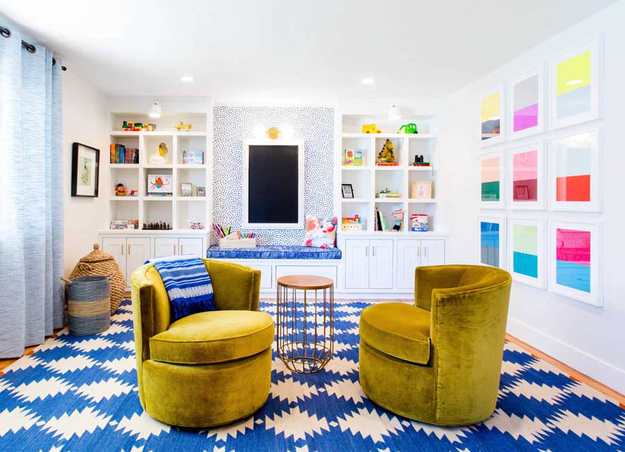
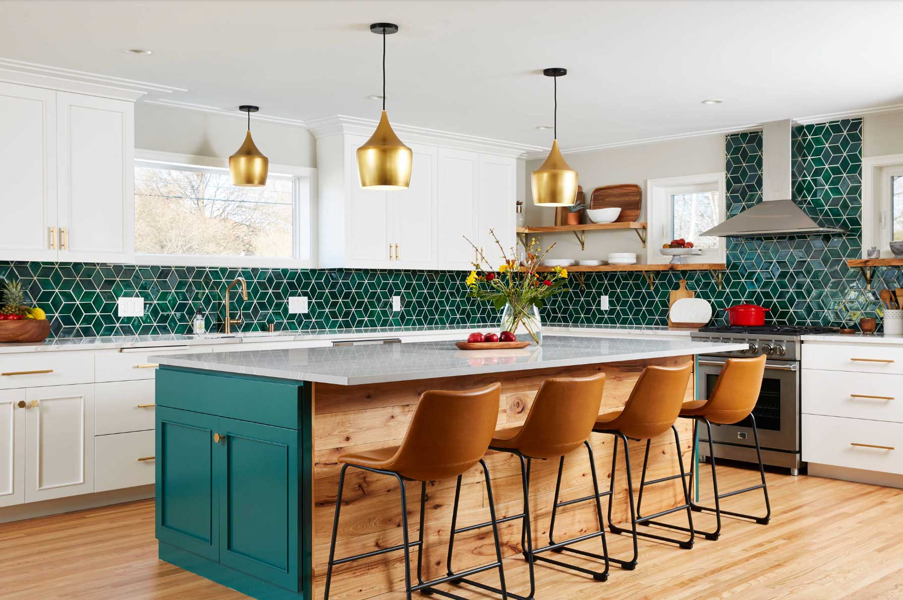
Color Makes a Statement
One thing we love about seeing colors evolve is how they are being used within interior design. Focusing on your own favorites, along with being true to yourself, consider what type of statement you’d like the colors to make in your home. Will the palette in your home blend smoothly with muted tones, will they contrast one another for a refined, yet impactful look, or will you select a dynamic mix for standout design?
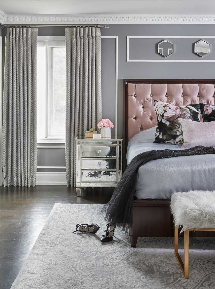
Your Perfect Sanctuary
Home design is very personal. Your home should be your happy place, and the look and feel will (and should) be very different from anyone else’s home. That being said, each room in your home will also feature its own vibe, creating the right environment for any circumstance. When you create your own personal sanctuary of relaxation, make sure the color palette you choose reflects feelings of calm and quiet–the ideal place that will make the weight of the world melt away.
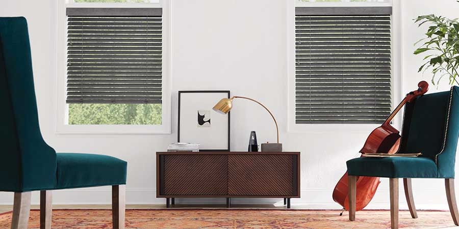
And that’s not all. We’d love to help you discover the ways window shades, blinds, shutters and drapery can make that happen. At A Shade Above, we’d love to work with you to create a beautiful balance of style and function. The rooms of your home tell their own personal story–the memories made, the way the light interacts, the colors that represent you–and we’d love for that story to deliver a happily ever after! Get in touch with us for your free consultation.